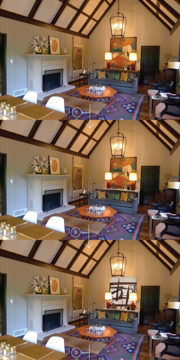
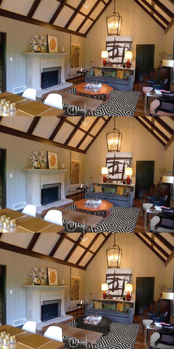
You guys know I’ve been fretting over my living room for a while. It’s a big space and it’s hard to get right. I purchased a really cool rug a while back but it just isn’t doing the trick and it’s way too colorful for the originally more muted palette I’d had planned. I like drama but more in the form of high contrast than in bold color. So I did a little photoshopping to see what our living room could look like if I made a few changes over time. It’s like a game of Where is Waldo. Can you spot the change at each step along the way?

 [1] The original space
[2] Painting the parson’s console at the back white
[3] Updating the art a la Franz Kline
[4] Changing the rug to this Dash and Albert option (graphic and well priced)
[5] Changing out the caned chairs seats to a grey color (probably would do a pattern in reality)
[6] Painting the coffee table black (I think an antique mirror top would be fabulous but I’m not that skilled at photoshop)