Hi Everyone! Jess Davis here. I’m really trying to blog more these days. It’s challenging though. As an interior designer and visual person I find short form media to be so much easier! I’ve been promising you a more comprehensive summary of our kitchen renovation though. So here goes.
The kitchen in our new house started off looking like this in plan – sorry for the blurriness – I only have this low res file – but you get the idea.
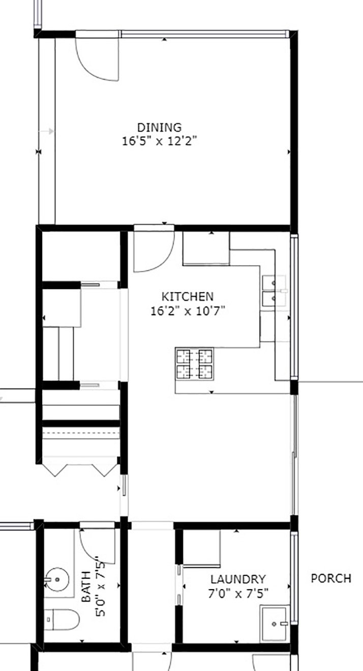
The actual size of the kitchen was not all that bad but as you can see, the layout was choppy, and it was closed off from the dining room and rest of the house (aside from the breakfast room). Here are some photos of the existing:
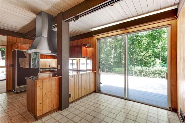
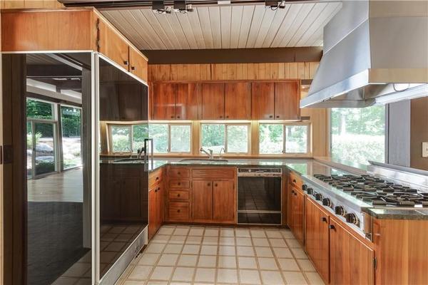
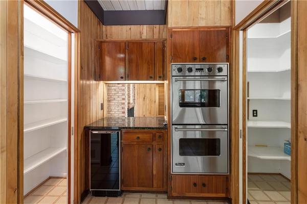 It’s odd the way there was this pass-through to the living room and a little nook where the ovens were. And these fairly large pantries that really broke up the flow. The appliances were in good condition and high quality – Viking and Kitchenaid – but not exactly what I would choose if I were selecting appliances now. And that column really cuts off the space.
I’m sure we could have done some upgrades that would have made the existing layout work, but I really wanted to do this right – for a few reasons. As an interior designer, this is a portfolio piece – plus it would be a real shame not to open the kitchen up to the dining room and the beautiful views beyond. Since we were reconfiguring the area south of the kitchen to create another bedroom, it just made sense to go ahead and add beams, delete the column and create our dream kitchen in this space.
We are planning to do a Phase 2 down the line where we connect the house with the garage, so the current exterior wall of the kitchen will later become an interior wall. People (namely my parents) seemed very concerned about the space being dark after eliminating the windows below the cabinets. I actually think though that the space will feel even lighter and brighter than it ever has. Opening it up to the dining room will bring in a lot of light from the windows. Widening the hallway so that the entry hall flows straight into the kitchen will also bring in light from the other direction and just opening up the plan in general will make the space feel more expansive. On top of that we are adding a Velux Skylight above the island which I think will be a real feature in the kitchen – the added natural light from above will really bring out the best in the dark stone island and black cabinets. I can’t wait to see the trees above through our skylight. Plus, another cool thing about this particular skylight is that it opens with solar power (via the Velux Active smartphone app), so we can bring in fresh air or release cooking odors from the kitchen.
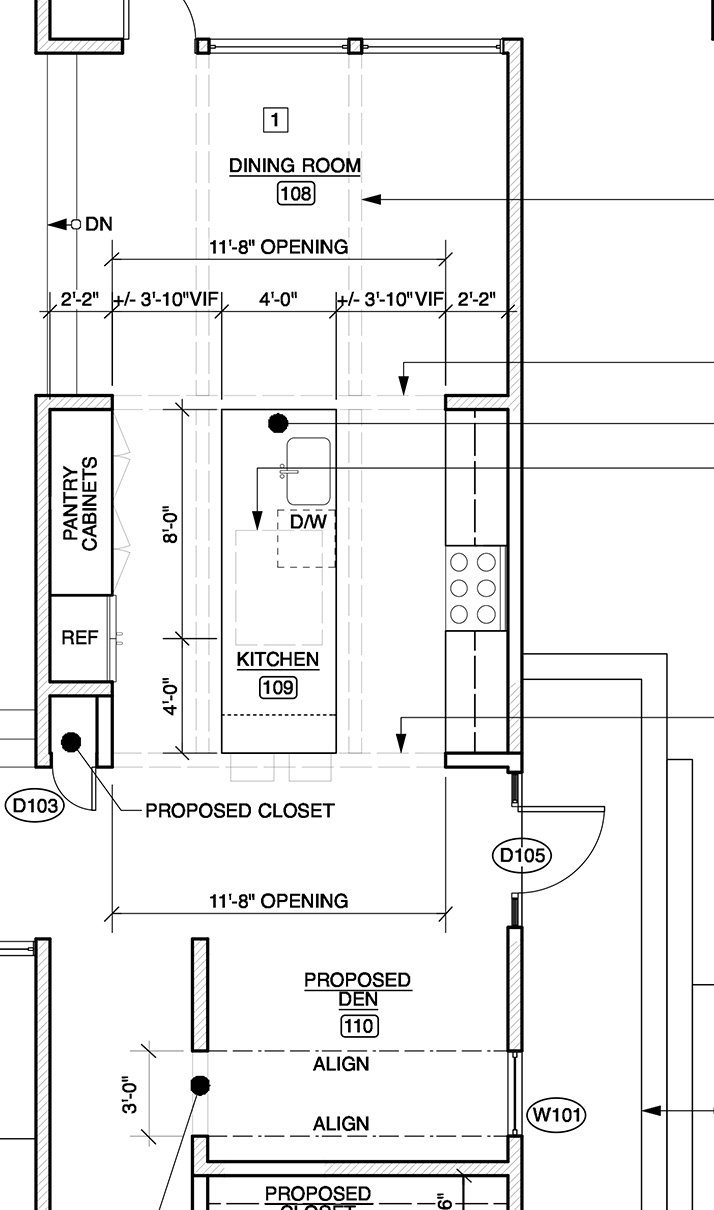
As far as the plan goes, the new layout is pretty straight forward and obvious. Here is what it is generally looking like (minus a few tweaks):
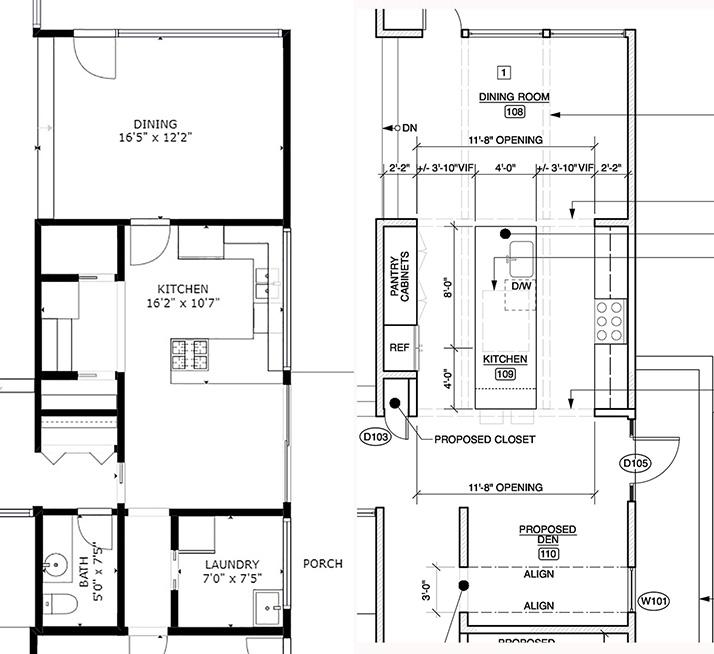
 And here are the two plans side by side so you can see the changes.
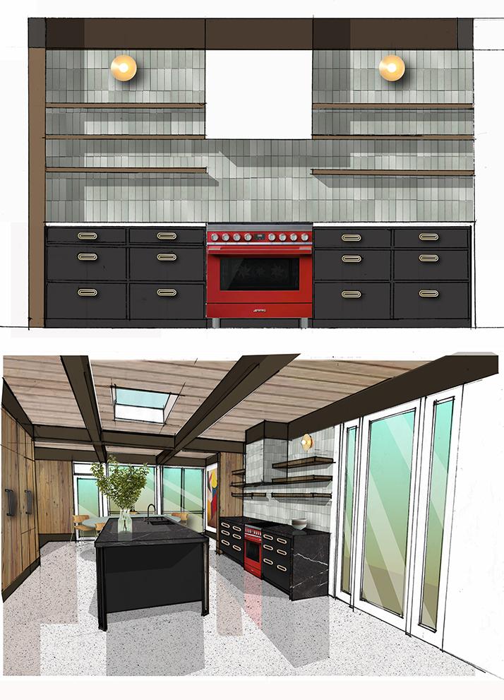
 Closing up the windows allowed me to create a range hood wall with a feature tile backsplash and open shelving. I have long debated the open shelving idea. It looks so good, but do things stay clean and neat looking? I think the answer is that you put stuff you use every day on those shelves – items that are plain and simple and sculptural – things that you wash often and don’t have the time to gather dust. On the top shelves you can put items that you barely use but that are beautiful – think vases and cake stands. Items that you don’t mind having to dust off a bit when you take them down.
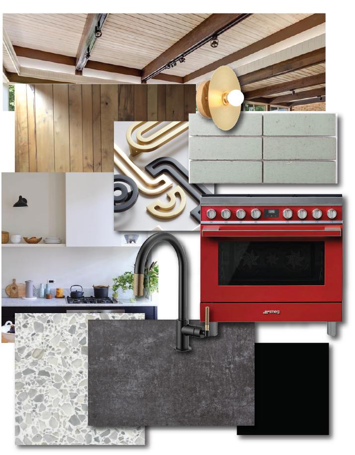
 Now let’s talk cabinets. To contrast with the open storage on the range side, the other side of the kitchen is all closed storage. Since this wall backs up to the paneled living room wall, I decided to create a sort of paneled volume or box so to speak that houses a small coat closet on the end, a built-in fridge, and pantry spaces. I love how clean looking this is going to be and I love the warmth and authenticity of the wood paneling. Yes! I am not painting it. Painted wood paneling is great but I love the warmth of the wood with the clean lines in this house. The wood cabinets will have black hardware (from my new Deco Series) and the other cabinets and island will be black with contrasting brass hardware.
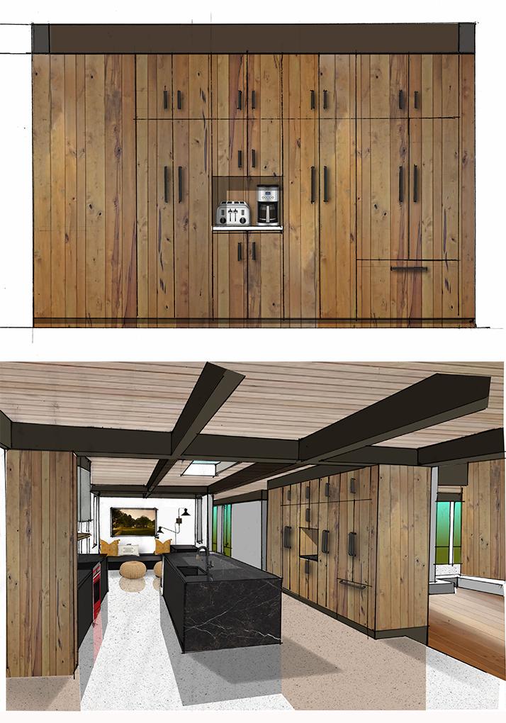 On to the kitchen island. The island is mainly storage, trash, a big sink, and a built-in microwave. My big debate, though was should it have seating? Should the seating be on both sides? In the end, since the kitchen opens up to a more casual dining room where we will actually eat our meals, we decided to opt for an open island end down by the den with only two stools for perching.
As far as other finishes, I waffled back and forth – light counters or dark counters. I finally decided that a black-ish veined countertop from Dekton with a black cabinets would look the most sophisticated and the very textural San Gabriel green/grey brick tile from Fireclay Tile would really stand out on the wall with the stove. I opted for a black sink from Build.com to work with the black counters and a really cool faucet with pull-out in brass and black with a bit of knurling for texture.
 I’m sure I’ve bored you with enough details for now. I’ll take you through the riveting appliance selection process in another post (can’t wait to talk about my Smeg Stove)
So there you go: A palette of wood, black, textured sage, brass, natural light, and a pop of red. What do you think? I’ve done a few kitchen renovations in my day, but I always appreciate feedback and suggestions. So suggest away – anything I’m missing?