Thanks to Mlle Paradis for her guest post on color – Grey is one of my favorites right now (not surprisingly since my living room is pewter, powder room is gunmetal and guest room is an almost black charcoal:
Hello to Jessica, and welcome to lovely baby Bryan. Thank you for letting me spend a little time here.
Hi everybody, I’m Mlle Paradis. I blog at Passage Paradis about L.A., England, a little of everything – mostly by way of my own photos and my love of color. I am a sometimes painter of pictures too, but this post started because I was painting my kitchen. And I was trying to decide what color to paint it. In the end I settled on an orange and grey palette, but not without a nice art-y, blog-gy detour through that color relationship. I hope you enjoy taking that little trip with me!
My last summer’s, kitchen project, started because I was unhappy with the maple cabinets that read so orange, but a bolt of inspiration came by way of GREY. It seemed like such a great idea. The combo of the two colors has always been a favorite of mine, though not easy to make work. In order to be sure about my choice, I had to investi – ruminate…….. And I found some great stuff in the blog world.
via poppytalk
Here’s a little of how the internal conversation went:
……Eyes mix color without our even knowing it. So I could have black and white in some parts of the room, which would stand in for grey. B/W gives a strong graphic punch. But: must tone the orange right down, otherwise it fights with the black and you get close to Halloween combinations. (Hello to self: “Oh yeah! That’s why we don’t normally decorate with it!?”)
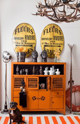
via Fiona at CafeCartolina
This above is a perfect integration of the orange and neutrals. Somehow the delicacy of the cabinetry and the sheen of the lacquer softens the orange. When I first bought my house, I happened on alot of orange lacquer along the lines of this cabinet and was really tempted by it…..but……go on, reread the preceding paragraph!

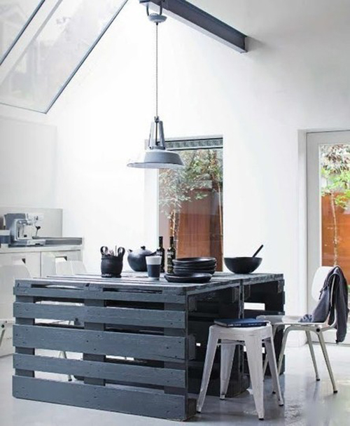
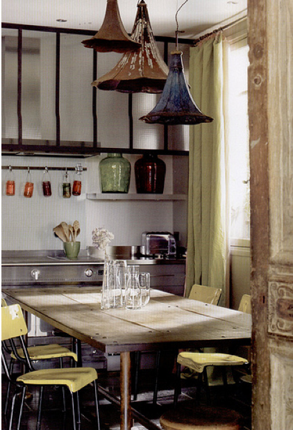
via bobbi at lazy designer
Grey can be so many things. Rustic, shimmery, industrial. And a variety of greys makes for such a restful visual. Which is what I think made the choice of grey most appealing to me.
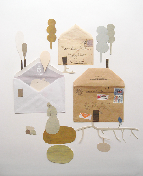
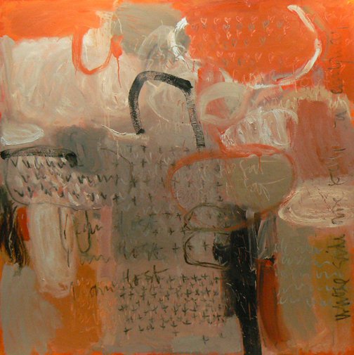
I love what Camilla Engman did with greys and oranges. (And recycled envelopes!) Wish I could hang this in my kitchen. There’s something at once sorrowful and joyful in this piece. A reminder to include some good art in the “new” kitchen.
Who knew grey could be so energetic?
I guess you could call these putty colors. Or stone. But I shy away from GREIGE. (Please!)
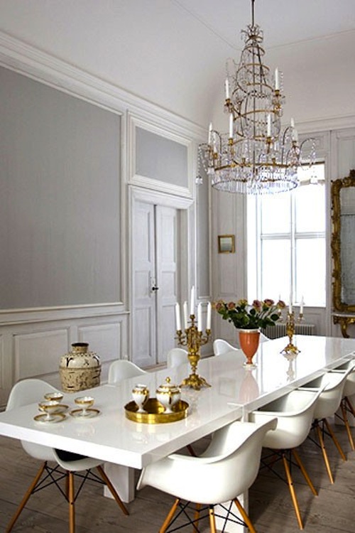
design darling via a perfect gray
This picture made me realize that I could pop in a lot of crisp white. A little shine. To get something quite elegant. You don’t even really need the French bits and bobs to get that effect.
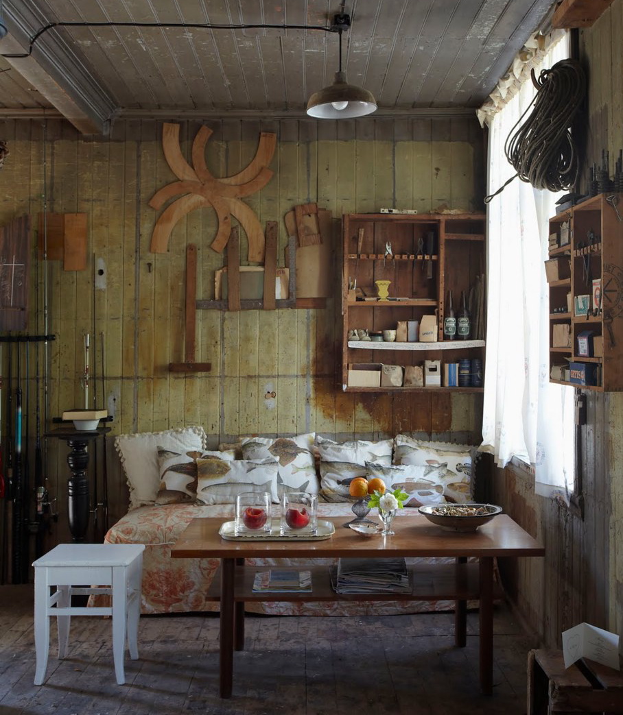
And yes, let’s really forget the “greige”. We’re talking silvered timbers here. Misty mornings. Barnacles and lichens. Pussy willows. Dried sage leaves. Inspiration seeps in from everywhere, doesn’t it?
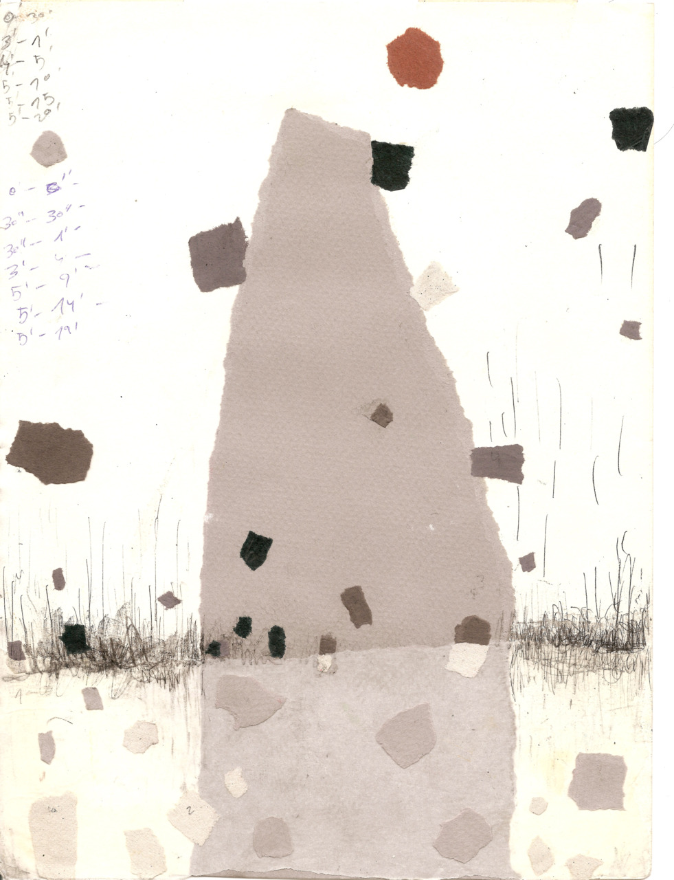
these two paintings and torn paper collage above, via Sophie’s’ Seed Capsules tumblr
Here again what art can teach us: this is like a modern take on a J.M.W. Turner – a London sunset through the fog and the soot. But see the equal parts orange and grey? That means you got some big old fight goin’ on here. Yeah ok. But London’s burning? Maybe not so much for my kitchen.
Again though. Something about a tidy grey with clean crisp edges makes you seem very snappy and on top of it all. Even if you’re just a painting. (Model take note.)
Whispers of grey?
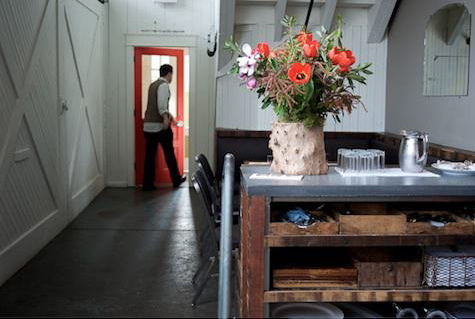
Washes of grey? Who doesn’t like the look and feel of slab floors and zinc counters? That’s what grey evokes. There’s something solid and timeless about it. It’s cool and warm at the same time. I was getting somewhere with all these pictures. Until…….
The very last inspiration picture. When I got to this picture, it was the end of June by then and starting to get very outside outside. The idea of staying inside and painting a kitchen was not really appealing. And I was inclined to just say:
“To hell with kitchens – – – – LET’S JUST GO ON VACATION”!

Which I did not. But this pic comes close, don’t it? BIG. SIGH.