The Atelier Davis team is currently working on a few kitchen renovations, and in the search for inspo, we’ve noticed a really cool kitchen trend: kitchens that don’t look like kitchens. We are all in on this concept! Take a look at how some designers have redefined kitchens.
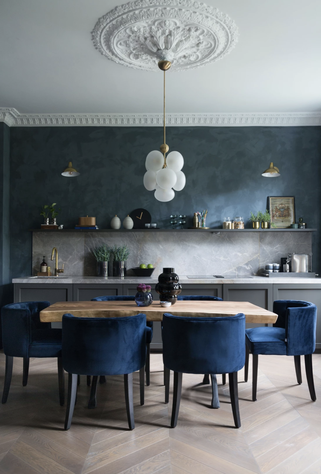
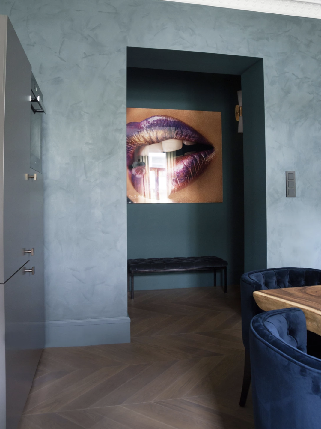
1. Norwegian design firm, Studio Gathe, created this kitchen-meets-dining room, toning down the appliances by dividing them across the room and playing up the “dining room” concept using a large center table and upholstered chairs. Not to mention the open shelving instead of upper cabinets, which is a trend seen throughout these picks.
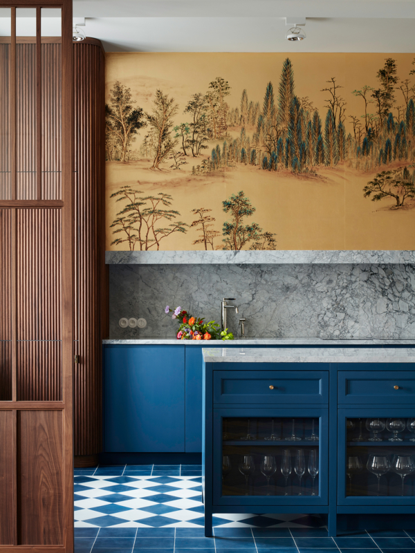
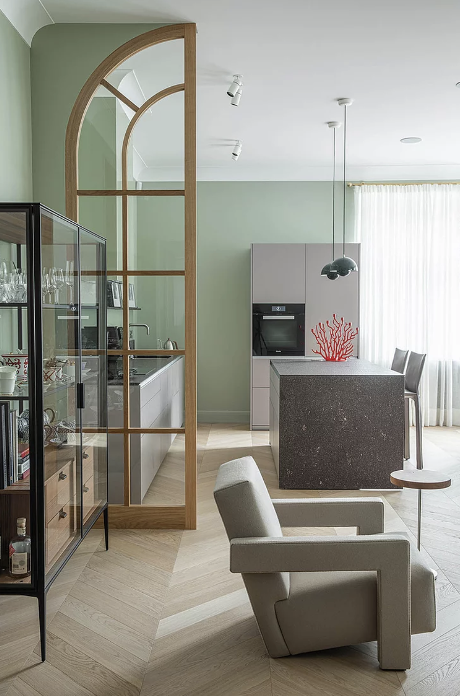
2. Polish firm Colombe made this stunning kitchen for their Noakowskiego project. They defined the kitchen area with the room dividers while still leaving its entryway open and airy. The obvious statement piece here is the hand-painted de Gournay wallpaper, which reminds us that it’s a space where you can sit back and dwell in.

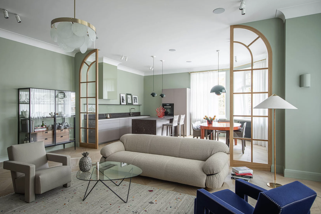
3. Agnes Rudzite uses room dividers similarly. Though the dividers help define the two spaces into living and kitchen/dining, the seamless wall color throughout makes this entire area cohesive. Again, the lack of upper kitchen cabinets gives the kitchen area an understated look.
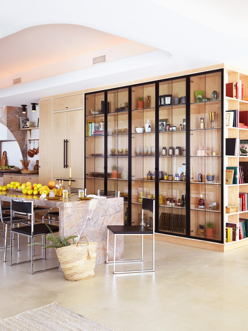
4. Dubbed “the healthiest condo in Canada” by Domino, the home of interior designer Andrea Kantelberg includes gorgeous display-case shelving, which we think is the key to making this area not look like a standard kitchen. Featuring kitchenware, barware, decor, and books, this area is clearly a mixed-use space.
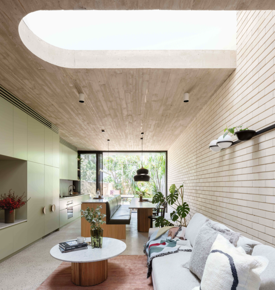
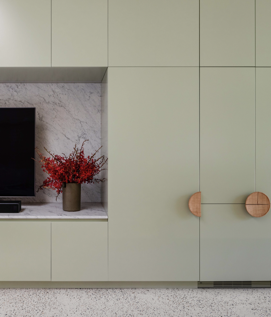
5. We love the seamless way this space by Sydney-based architect Carter Williamson comes together. The millwork at the “Concrete Blonde” project encompasses the kitchen cabinets and appliances, as well as living room cabinetry too!
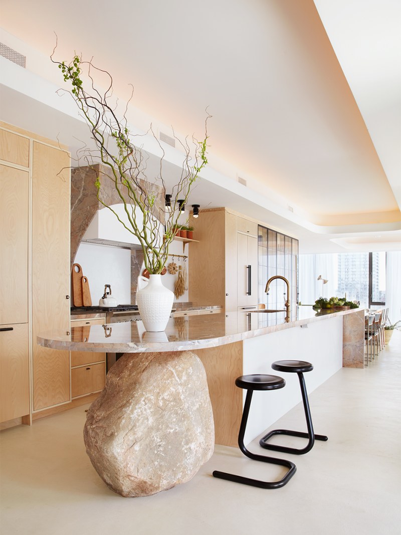
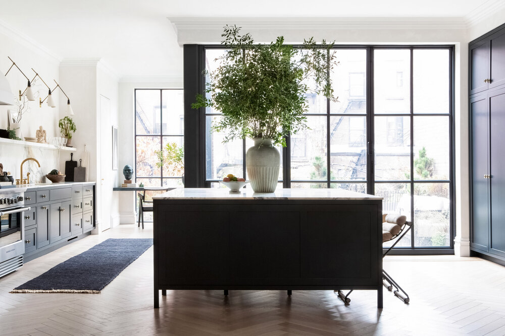
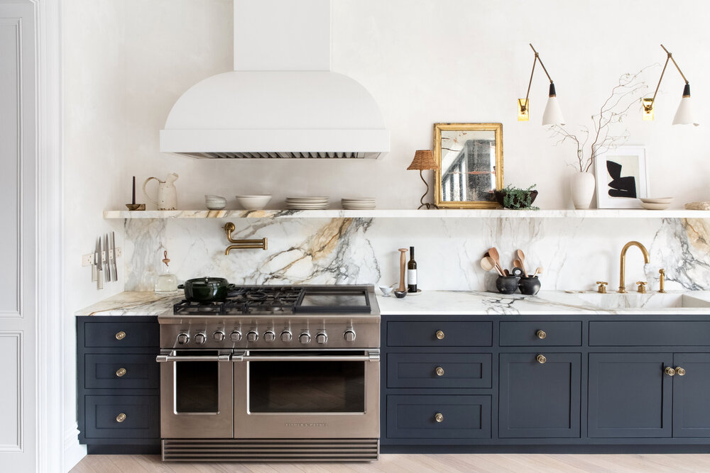
6. Last but certainly not least is the Brooklyn townhouse of Athena Calderone, creator of lifestyle brand Eye-Swoon. The footed kitchen island says “furniture” much more than a traditional kitchen island, and the open shelving and library sconces lends both a warmth and openness.
There you have it! 6 kitchens that don’t look like kitchens — or rather, livable dwelling spaces that aren’t solely used for their utilitarian purposes. Giving us all the inspo at Atelier Davis!