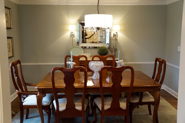
Last week I showed you the living room for a client project that I completed toward the end of last year. Well today I’d like to share the dining room with you. The dining room was not a complete overhaul. Really we just replaced the furniture. My client liked her drapes, wall color, rug and chandelier so the challenge was to keep these items but make the room tie into the simpler more up-to-date look that the living room now had. Here is what the dining room looked like before with it’s reddish Queen Anne style dining set.
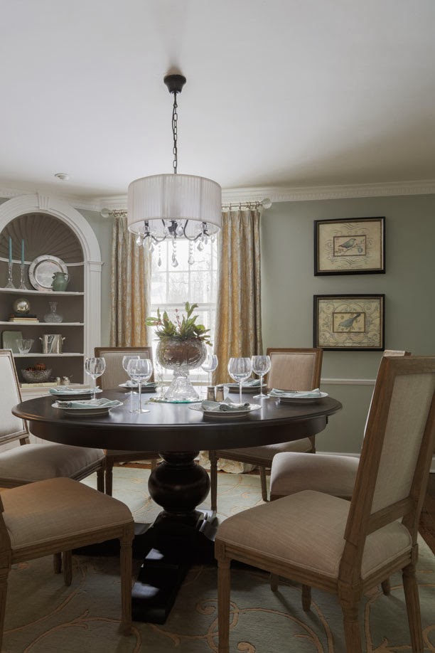
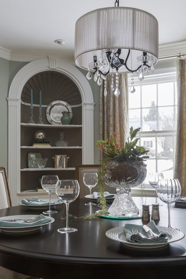
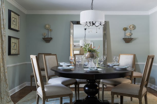
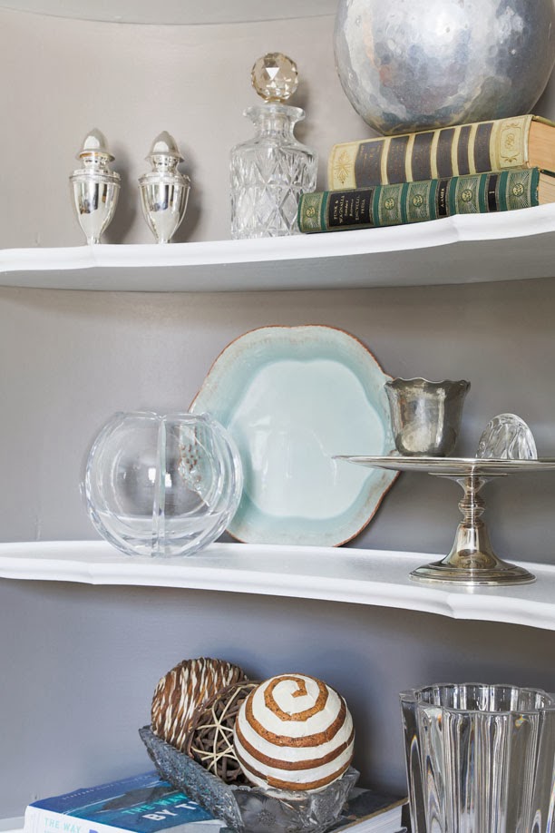
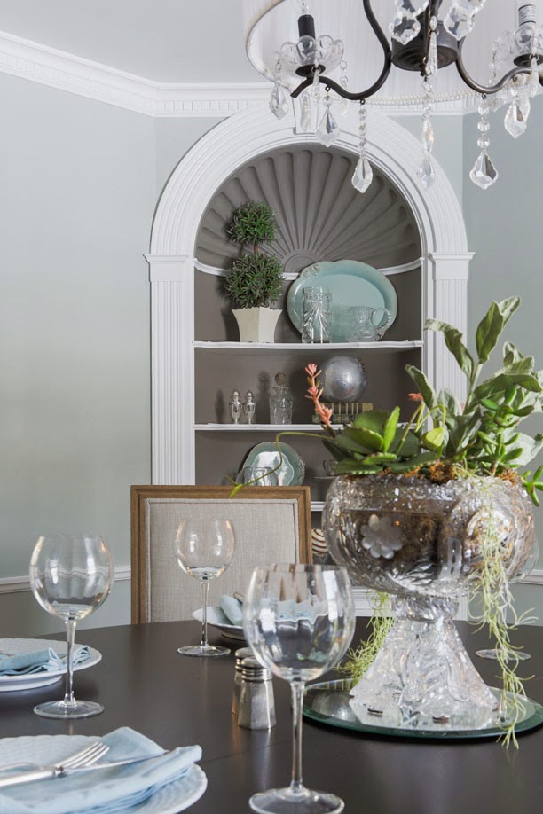
The dining set really didn’t work shape-wise for the square room, so we knew we wanted a round table with a leaf. And we didn’t want everything to look matchy, so we chose a dark table and greyed wood chairs that tie in really nicely with the living room. We painted out the niches with the same dark grey/taupe that is on the living room walls. The new paint color really popped the niches and the accessories inside them and brought out some of the taupey grey in the existing draperies. We put in a large floor length mirror in the center of the room which really expanded the volume and added some brackets with artifacts on either side to fill the negative space. Re-styling the niches with the owners existing accessories really changed the feel of the room as well. We made her crystal and silver collections seem less formal by pairing them with books and other natural elements. It’s amazing how well it works now with the living area just across the hall.

