Today, we’re thrilled to share the next phase of our latest local design project! We’re diving into the heart of the home with our new kitchen and breakfast nook moodboards.
As a quick recap, we recently shared our design schemes for the entry, dining room, library, and family room. Because this kitchen is completely open to the family room and includes an attached breakfast nook, creating a cohesive flow between the spaces is essential.
Currently, the kitchen is a fairly standard, newly renovated bright white space. While it’s a great blank canvas, it’s lacking the character and personality of our clients. Our mission? Transform it into an inviting, personality-filled hub.
To start, we are painting the kitchen, breakfast nook, and family room a crisp, cohesive white (goodbye beige!). From there, we’ll use striking statement pendants, stylish barstools, and curated decor to inject color, warmth, and texture.
For the breakfast room, the goal is to lean into vibrant, poppy colors rather than safe, muted tones. This space is designed for casual everyday gatherings—think family game nights, quick lunches, and relaxed dinners. To maximize comfort and make the space feel inviting, we plan on building a custom banquette against the windows.
We’ve designed two distinct design schemes to bring this vision to life:

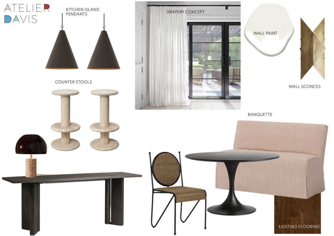
Scheme 1: Modern Luxury & High Contrast
The first scheme skews neutral while leaning heavily into a luxurious, high-contrast aesthetic.
- The Details: Sleek black pendants offer a sharp contrast to metallic wall sconces.
- The Vibe: A sophisticated interplay of black and white, anchored by interesting geometric shapes in the barstools, dining chairs, and lighting fixtures.

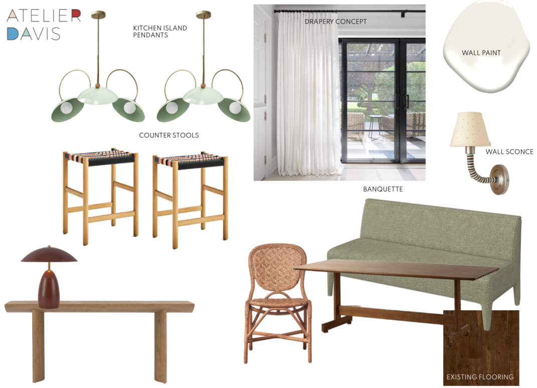
Scheme 2: Vibrant, Earthy & Colorful
The second scheme is a brighter, more playful approach that brings the outdoors in.
- The Details: The island pendants serve as a major statement in both color and shape, beautifully tying into a bold green banquette concept.
- The Vibe: A fresh blend of organic textures like rattan, rich greens, and warm neutrals that feel lively yet grounded.
Which direction would you choose for your home? Are you team high-contrast luxury, or do you love the more earthy look? Let us know in the comments below!